Feeds:
Posts
Comments

Archive for April, 2020

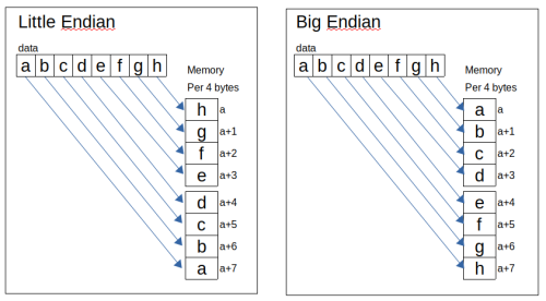
What is Little Endian?
It’s a way of bytes are stored in Computer Memory.

Then what is Little Endian? It’s bytes stored in computer memory where the least significant byte byte occupies the lower memory address.

It will be easier if I show you the sample below:

For Example I have data: abcdefgh or 61,62,63,64,65,66,67,68 in hexadecimal number (a=61 in Ascii table). If it’s loaded in memory, it the order will be:

 d, c, b,a      h, g, f,e
64,63,62,61    68,67,66,65

The easier way, read from right to left per 4 bytes.
endian-mem

(more…)

Read Full Post »

I try to make comparison about Memory Layout between x86-32 bit and x86-64 bit in Linux.

I run 3 different programs, code written in Assembly, C language and python to see how they are loaded into the memory. Then each program I make another 2 copy. So, each language will represent 3 programs.

I use tmux in Linux Terminal, so we can see all programs run together.

Before we start, you have to know the concept behind memory layout in Linux so you will understand what I’m going to explain in this article.

Memory Layout in Linux
For Architecture 32 bit, at the time a program is loaded into memory, all sections of the programs are loaded into each part of the memory. All codes and data which are declared all brought together, even if the source code is separated. The instruction in .text section is loaded into address 0x0804800. Followed by .data section and .bss section. The last address of linux is 0xbFFFFFF.

See the picture below:
memlayout00

In this tutorial, I use AMD processor (Intel compatible). Since the byte order use Little Endian which is start with LSB (lowest significant byte), we have to read the memory from bottom to up.

Virtual Memory Organized
If all programs are loaded in the same location in the memory, why it never over lap each other?
It’s because the program only access the Virtual Memory.
Physical Memory is RAM chip of your computer.
Virtual Memory is the way program think about the memory.
Before a program is loaded in a memory, Linux will search for the empty physical memory that big enough to hold the program. Then it will tell processor to pretend that this memory address is real address of 0x08048000 for the program to stay. After that each program will have it’s own sandbox to play.

Every program will believe that they are stand alone and enjoy all they memory that they have.
So, the address that program believe to use is named Virtual Address meanwhile the real address in the memory chip is named Physical Address.
Process that pointed virtual address to physical address is named Mapping.

Multi tasking in Linux
The Core of Linux is a Block Code that is name Kernel. Memory System is marked as Kernel Space and User Space. Communication in between is handled by System Call. Access to Hardware is limited in software that is run in Kernel Space and only can be done via Kernel Mode Device Drivers.

VDSO (Virtual Dynamically Linked Share Object).
VDSO is memory area allocated in user space for kernel functionalities purpose. It’s kernel mechanism that is used for program to call Kernel Space routines. VDSO use standard mechanism for linking and loading ELF format (Executable and Linkable Format).

(more…)

Read Full Post »

Pandas in Python Library that is used for Data Manipulation and Analysis. It came from terms “Panel Data”. It’s open source under three-clause BSD License. Original developer was Wes McKinney in 2008 while he worked at AQR Capital Management to process Quantitative Analysis on financial data. It was written in Python, Cython and C.

Pandas in mainly used for Machine Learning.

There a lot of features available that you can used for:
-reading and writing various data format, csv, MS excel, json, html, SAS, SPSS, SQL, Google Big Query, Stata, Msgpack etc.
-Group, Join, Merge, Filter, Pivot, Reshaping data set.
-Time series function and so many more.

Installation
In this tutorial I use Python 3.6.9 (default, Nov 7 2019, 10:44:02), so the installation command will be: pip3 install pandas.
From Linux terminal type:

$ pip3 install pandas
Collecting pandas
  Downloading https://files.pythonhosted.org/packages/bb/71/8f53bdbcbc67c912b888b40def255767e475402e9df64050019149b1a943/pandas-1.0.3-cp36-cp36m-manylinux1_x86_64.whl (10.0MB)
    100% |████████████████████████████████| 10.0MB 48kB/s 
Collecting python-dateutil>=2.6.1 (from pandas)
  Using cached https://files.pythonhosted.org/packages/d4/70/d60450c3dd48ef87586924207ae8907090de0b306af2bce5d134d78615cb/python_dateutil-2.8.1-py2.py3-none-any.whl
Collecting numpy>=1.13.3 (from pandas)
  Downloading https://files.pythonhosted.org/packages/07/08/a549ba8b061005bb629b76adc000f3caaaf881028b963c2e18f811c6edc1/numpy-1.18.2-cp36-cp36m-manylinux1_x86_64.whl (20.2MB)
    100% |████████████████████████████████| 20.2MB 45kB/s 
Collecting pytz>=2017.2 (from pandas)
  Using cached https://files.pythonhosted.org/packages/e7/f9/f0b53f88060247251bf481fa6ea62cd0d25bf1b11a87888e53ce5b7c8ad2/pytz-2019.3-py2.py3-none-any.whl
Collecting six>=1.5 (from python-dateutil>=2.6.1->pandas)
  Using cached https://files.pythonhosted.org/packages/65/eb/1f97cb97bfc2390a276969c6fae16075da282f5058082d4cb10c6c5c1dba/six-1.14.0-py2.py3-none-any.whl
Installing collected packages: six, python-dateutil, numpy, pytz, pandas
Successfully installed numpy-1.18.2 pandas-1.0.3 python-dateutil-2.8.1 pytz-2019.3 six-1.14.0
$

pandas01
(more…)

Read Full Post »

It’s fun that Math formula can visualize ‘LOVE’ word.
Type the code below in your python IDE and run it.

import matplotlib.pyplot as plt
import numpy as np
L=np.arange(0,6,0.1)
O=np.arange(-3,3,0.1)
V=np.arange(-2,3,1)
E=np.arange(-3,3,0.1)
fig,(ax1,ax2,ax3,ax4)=plt.subplots(ncols=4)
ax1.set_title(r'$ y=\frac{1}{x}$') #display Math formula
ax1.plot(L,1/L)                    #print L
ax2.set_title(r'$ x^2+y^2=9$')     #display Math formula
ax2.plot(O,(9-O**2)**0.5)          #print O
ax2.plot((9-O**2)**0.5,O)
ax2.plot(O,-(9-O**2)**0.5)
ax3.set_title(r'$ y=|-2x| $')      #display Math formula
ax3.plot(V,(abs(-2*V)))            #print V
ax4.set_title(r'$ -3|sin y| $')    #display Math formula
ax4.plot(-3*abs(np.sin(E)),E)      #print E
plt.show()

love-code
love

Read Full Post »

Pie is very useful to visualize relative proportions of a data set and easily to be understood. The size of the circle will calculated based on the total quantity it represents.
pie01
For example:
There are 3 color in a cirlce, Grey 25, Blue 25 and Green 50.
So total circle size is: 25+25+50=100
The size for the color will be:

Grey  → 25/100 = 0.25 x 100% = 25%
Blue  → 25/100 = 0.25 x 100% = 25%
Green → 50/100 = 0.25 x 100% = 50%

Let’s say the size total is not 100, Grey 30, Blue20 and Green 40.
The total size is: 30+20+40=90.
What the percentage will be?

Grey → 30/90 = 0.3333 x 100% = 33.33%
Blue → 20/90 = 0.2222 x 100% = 22.22%
Green → 40/90 = 0.4444 x 100% = 44,44%

pie02
(more…)

Read Full Post »

Histogram is also a bar type graph chart. The main different between Bar Chart and Histogram Chart are:
Bar Chart for compare numeric data among Categories.
Histogram Chart for compare numeric data in a Category which is distributed into ‘bin’ or ‘bucket’. The term of ‘bin’ in here is a group data.

For example:
you have 24 population in a town with age below:

5,6,7,5,6,4,10,15,14,13,30,35,23,36,45,49,40,51,55,53,60,65,66,70

and you want to visualize it into a graph.

Let’s try.
Open your python IDE and type the code below.

import matplotlib.pyplot as plt
age=[5,6,7,5,6,4,10,15,14,13,30,35,23,36,45,49,40,51,55,53,60,65,66,70]
plt.hist(age)
plt.show()

hist01
hist02

(more…)

Read Full Post »

In this tutorial, I will show you how to create Bar graph. Many people use Bar graph because it’s easy to presenting a comparison between 1,2 or 3 value. More than that it’s not recommended because it will be difficult to show the comparison.

Bar Chart can Vertical or Horizontal, depend on what you need.

Single Bar Vertical
Let’s try with Single bar vertical. Type the code below and run in your python text editor.

import matplotlib.pyplot as plt
month=['Jan','Feb','Mar','Apr','May','Jun','Jul','Aug','Sep','Oct','Nov','Dec']
revenue=[100,110,120,100,90,115,70,90,140,100,110,120]
plt.bar(month,revenue) 
plt.title('Simple Bar Graph') 
plt.xlabel('Month') 
plt.ylabel('Revenue (K)USD')
plt.grid(linestyle='dotted',axis='y')
plt.legend() 
plt.show()

bar01
bar02
(more…)

Read Full Post »